


1
2
3
4
5
Being one of the largest animal shelters in the local area, the Wake County Animal Center’s website contains a lot of content (they take in an average of 45 animals each day) with several views. The WCAC’S efforts in informing their website users of all necessary information is made apparent when visiting their site.
The Pain Points
Busy and excessive were the first impressions I had when browsing the WCAC home page:
1. There is too much text, specifically ‘happy talk’, that is unnecessarily repeated throughout the page, discouraging the user from browsing and going straight to the search bar.
2. The current search bar has a dropdown menu that lists ‘Search WakeGov’, ‘Library Catalog’, ‘Register of Deeds’, and ‘Human Services’, most of which have nothing to do with the animal center and what the user will be searching for on this site. Omitting the dropdown menu and ‘Advanced Search’ link will give the users less confusion.
3. There are also double exposed links to pages that are already presented in the main navigation. For example, the ‘About Us’ in the nav bar leads to the same page as the ‘About the Animal Center’ button a little further down. Eliminating all of the fluff will create a cleaner design and better navigation experience for all users.
4. Most users are coming to this website with interest in adopting an animal. With that in mind, I went to the adoption page gallery, but it has a completely different layout and feel to it. Not only is it inconsistent in design, but it looks like the home page of a completely different site, confusing the user! Although the simple layout is nice, the text in the banner (that do not seem clickable) take us to the same page as the image below the banner. Again, an issue with extra noise.
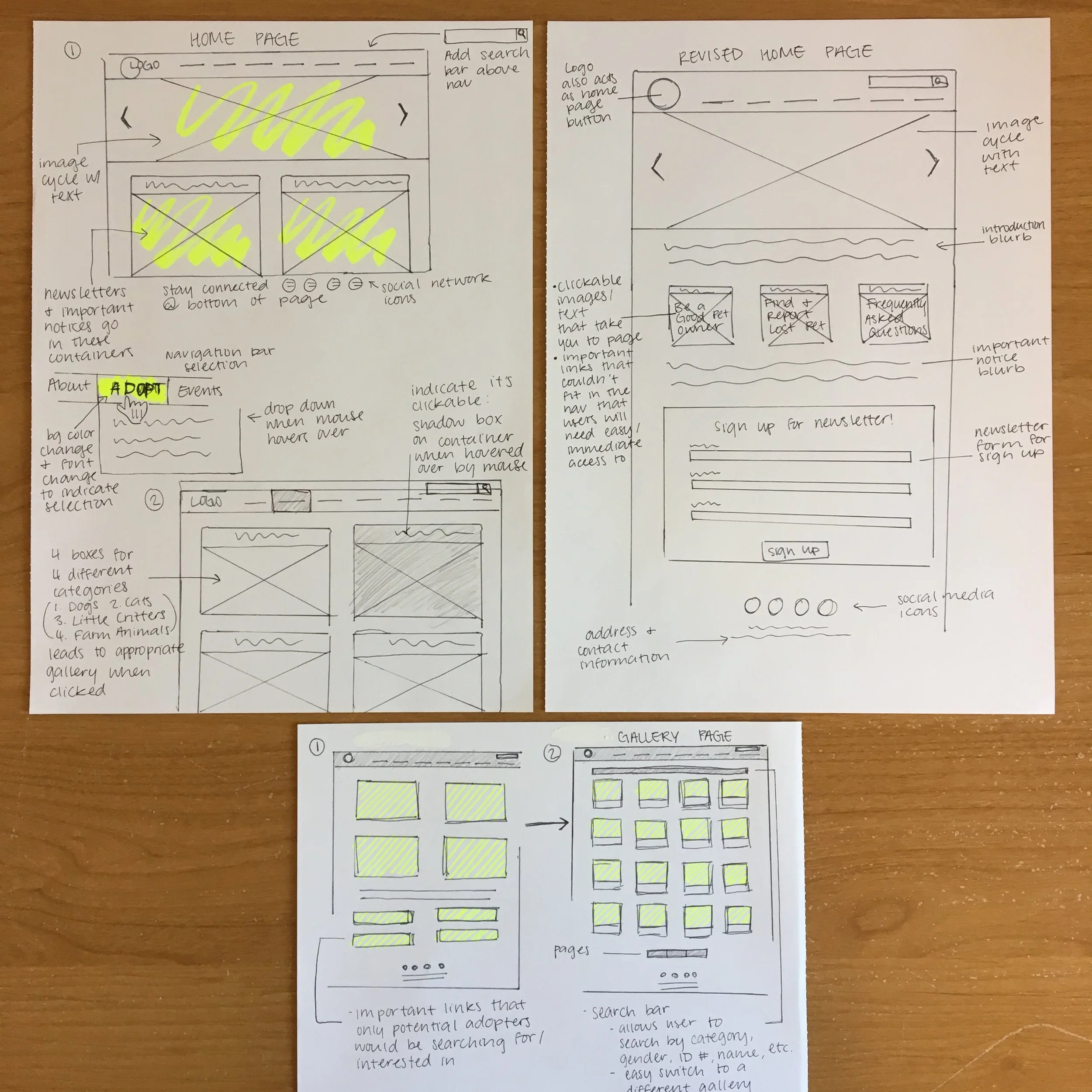
The Process
After identifying these pain points, I sketched out the layouts of various designs and revisions of the Home and Adopt pages. This allows me to quickly determine what design flows and layouts would work.
For the Home page, I condensed the paragraphs of text by only keeping important notices and removing extra buttons that would lead to the same pages in the navigation bar. Below the carousel banner, I kept the concept of clickable images for links that the user will want immediate and easy access to.
I also added in a ‘Sign up for a newsletter’ form on the home page. The site currently has a link that takes you to another link and two more pages just to get to the form. Let’s save the users some time!
For consistency, I incorporated clickable images on the Adopt page, allowing the user to go directly to what they are browsing the site for. Underneath are notices and links that potential adopters would be interested in viewing.
The Final Design
For this case study, I wanted to experiment with a more exciting color palette that balances warm and cool tones. As mentioned before, most users are visiting the site to view adoptable animals, so more images and a brighter feel were important elements when designing.
After these design changes, we are left with a clean and easy-to-navigate WCAC website!
Current Home Page
Current Adopt Page
Wireframes